
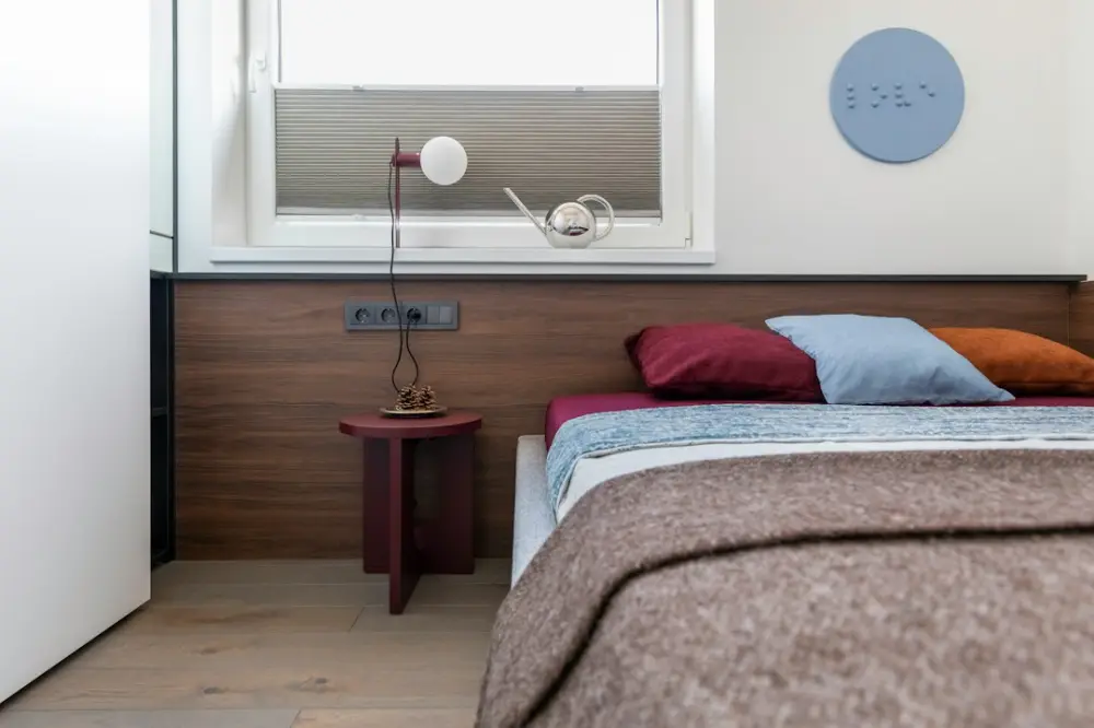
Color and material coherence is the practice of selecting interior elements that share visual or tactile properties to create a unified aesthetic. By aligning color palettes with physical textures—like wood grain or linen—homeowners can ensure a seamless transition between rooms, fostering a sense of balance, serenity, and intentional design throughout the living space.
In compact homes, visual clutter often stems from a lack of coordination rather than a lack of physical items. Establishing a baseline of shared tones and materials prevents the eye from jumping between competing focal points. This approach turns a series of small rooms into a cohesive environment that feels larger and more deliberate through the use of shared design language.
Defining Color and Material Coherence
Coherence in interior design is often referred to by professionals as the "red thread"—a consistent element that weaves through different spaces to provide a sense of continuity. This does not mean every room must look identical. Instead, it involves selecting a primary material, such as light oak or brushed stainless steel, and repeating it in various forms across the kitchen, living area, and workspace. For example, a studio apartment might use the same walnut finish for a desk, a floating shelf, and a coffee table base.
When color and material are treated as a single unit, the design becomes more resilient to trends. A specific shade of navy blue feels different when applied to a velvet sofa versus a matte-painted cabinet. Coherence is achieved when the Light Reflectance Value (LRV) and the tactile finish of these surfaces complement one another rather than clashing. In 2026, homeowners are increasingly moving away from high-contrast "accent walls" in favor of tonal layering, which utilizes various shades of the same hue to add depth without breaking the visual flow.
Interior Design Color Palette Basics
Selecting a palette for a contemporary home requires an understanding of how colors interact with natural light. A successful palette usually consists of a primary neutral, a secondary supporting tone, and a tertiary accent. For those focusing on minimalist interior design: essential principles for a calm environment, the primary neutral often covers 60% of the visible surfaces, including walls and large floor rugs.
A practical example of a coherent palette is the "Earth and Ore" scheme. This involves using warm grays (primary), sand-toned textiles (secondary), and blackened steel hardware (accent). Because these colors exist in a similar saturation level, they move together through the home without creating jarring transitions. When styling compact interiors, lighter palettes are traditionally preferred to maximize the sense of space, but coherence allows for darker tones if the materials—such as dark stained wood and charcoal wool—are applied consistently across the floor plan.
Matching Textures to Your Color Scheme
Texture provides the physical depth that color alone cannot achieve. A monochromatic room can feel flat and clinical without a variety of surfaces. To match textures effectively, consider the "temperature" of the material. Cold materials like glass, polished marble, and chrome pair well with crisp whites and cool blues. Warm materials like terracotta, jute, and reclaimed timber suit creams, ochres, and forest greens.
In a practical setting, consider a small reading nook. If the wall color is a soft terracotta, matching the texture might involve a chunky knit throw in a similar shade or a clay vase on a side table. This repetition of the color through different textures creates a sophisticated, layered look. Using a color wheel can help identify complementary textures; for instance, the rough grain of plywood often balances the smooth, industrial feel of concrete-gray paints.
Digital Design Tools and User Privacy
Planning for home coherence often involves digital mood boards and floor-planning software. In the current 2026 landscape, the choice of tool is as much about functionality as it is about data sovereignty. Many modern design platforms now prioritize local-first storage, meaning your home’s dimensions and personal aesthetic preferences are stored on your device rather than on a central corporate server. This is a critical consideration for citizens who value privacy while organizing their living spaces.
When using digital tools to test color swatches or furniture layouts, look for applications that offer "privacy by design." These tools allow you to import photos of your rooms to test material overlays without the data being used for targeted advertising. For instance, open-source 3D modeling software allows for precise material mapping—letting you see how a specific marble grain looks under different lighting—without requiring a persistent cloud connection or the sharing of personal location data.
Steps for Room-to-Room Visual Flow
Achieving flow is essential for making a small home feel expansive. Follow these steps to ensure your design remains coherent as you move from one area to another:
- Conduct a Material Audit: List the dominant materials in each room. Identify which ones appear most frequently (e.g., brass, light wood, or glass).
- Establish a Bridge Element: Choose one material or color to act as a bridge. If your kitchen has marble countertops, use a marble coaster or a small marble-topped pedestal in the living room to link the two spaces.
- Standardize Hardware: One of the simplest ways to create flow is to use the same door handles, cabinet pulls, and light switches throughout the home. This creates a rhythmic consistency.
- Align Flooring Transitions: Avoid using different flooring for every room. If you must change materials (e.g., from wood to tile), ensure the color tones are within two shades of each other to minimize the visual break.
Sustainable Styling Categories
Coherence is not just about aesthetics; it also involves the lifecycle of the materials used. Sustainable styling focuses on high-quality, durable materials that age gracefully together. This includes FSC-certified timbers, organic linens, and low-VOC (Volatile Organic Compound) paints. By choosing natural materials, you often find that coherence happens organically, as natural tones—stones, woods, and fibers—naturally complement one another.
When implementing small space, big impact: creative home styling, look for products categorized by their environmental footprint. In 2026, many manufacturers provide transparency reports on the carbon cost of their goods. Selecting items within the same sustainable category, such as "recycled polymers" or "upcycled textiles," often results in a shared industrial or organic look that reinforces the home’s overall design narrative.
Products for Achieving Home Coherence
To implement these strategies, focus on products that offer modularity and material honesty. Modular shelving units that can be expanded or reconfigured are ideal for maintaining a consistent look as your needs change. Look for furniture series that use a unified material palette; many contemporary designers now release "collections" specifically designed to bridge the gap between dining, working, and lounging areas.
Textile sets also play a major role. Instead of buying individual cushions, consider purchasing sets that vary in texture but remain within the same dye lot. This ensures that the "material" (the fabric) and the "color" (the dye) are perfectly synchronized. For compact interiors, integrated storage solutions that match the wall color can "disappear" into the architecture, allowing the chosen materials of your statement furniture to stand out more clearly.
At Transparentsea, we approach home styling with the same rigor we apply to data journalism. Understanding the mechanics of color and material coherence allows readers to make informed decisions that improve their daily environment. By focusing on practical, privacy-respecting tools and sustainable materials, Transparentsea helps citizens navigate the complexities of contemporary living with clarity and purpose.